Redesigning Vodafone Idea's Internal IT Infrastructure app to enhance efficiency and productivity
Vodafone Idea is the 3rd largest mobile telecommunication network in India
It has a subscriber base of 212.45 million as of 30 September 2024. It provides pan-India voice and data services across 2G, 3G, and 4G platforms.
MY ROLE
Responsible for research,
conceptualization and design
TEAM
Me (UX designer), a UI Designer & Internal stakeholders from IT Infrastructure team
UNDERSTANDING REQUIREMENT
One of Vodafone Idea's key verticals is IT Infrastructure. My point of contact is Sudeep, a member of the IT Infrastructure team.


KEY TAKEAWAYS fROM THE MEETINGS
User Types:
The app will be used by four types of users:
Field Engineer (FE)
FE Manager
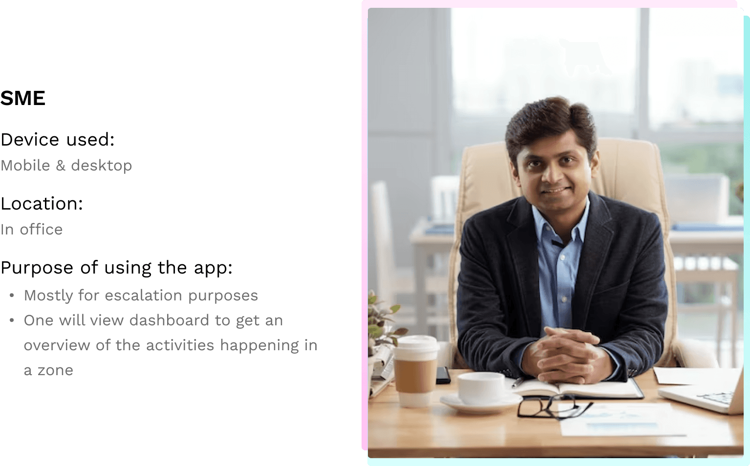
SME
Corp User
4 sub-domains under IT Infrastructure
Fiber
Transmission
Mobility
Enterprise
CHALLENGE
Optimize IT infrastructure and efficiency
As India’s leading telecom operator providing connectivity to nearly 270 million mobile customers (as of December 2020), Vodafone Idea Limited needed to optimize its IT infrastructure.
Teams’ manual daily operations resulted in low operational efficiency and multiple errors.
Disconnects between automation tools caused security and compliance risks, inefficient use of resources, and financial penalties caused by frequent breaches in service-level agreements (SLAs).
SOLUTION
A bundled app for all the users in all 4 domains
With a bundled app, Vodafone Idea Limited will improve the service management platform that offers business units IT visibility and control regardless of location or operating system.
An integrated app with its automation tools into a unified platform, dashboard, auditing, and reporting system.
USER INTERVIEWS:
We need to interview all user types, as each will have unique needs
and requirements.
Sudheer B - DGM Domain: Fiber
I would want to view:
- Productivity of manpower
- Zonal network health
- Trend analysis for productivity and network health in dashboards
I prefer mobile devices to view dashboards
Based on the performance, reward & recognition will happen at all levels (zonal, circle & national level)
Manoj M - VP Domain: Transmission
Our FE is active from 8am to 8pm
- There is a lower task check frequency during odd hours
- Keeping this behaviour in mind one has to consider app notifications like alarms for timely task responses & completion.
Transport FE does various type of tasks like:
- Preventive maintenance
- Change requests
- Manager-assigned tasks
- Self-assigned tasks
Anand Subramanian - GM Domain: Enterprise
There are three broad categories under which 'create task' can be managed are:
- Service delivery
- Feasibility
- Assurance
Enterprise Engineer focuses on daily tasks assigned by manager (feasibility, delivery, or self-assigned task).
Circle Enterprise lead oversees governing activities (delivery, feasibility, faults, operations) in their circle.
Rahul- AGM Domain: Mobility
Our Engineers go on-site to resolve TTs from SNOC.
Typically they visit 4-5 sites daily.
If there are no faults, they conduct preventive maintenance at allocated sites.
User Hierarchy

User Personas
Based on the insights gathered from the user interviews, I will now create user personas to clearly define their roles and responsibilities.


Here are few screens of the current app:

MY TAKE ON THE DESIGN
Currently, the app supports only two user types: Field Engineers (FE) and FE Managers, while SME and Corporate Users are not included. If we expand the app to accommodate these additional user types, their specific needs will also need to be addressed.
Since this is an internal app and not consumer-facing, I won’t focus on the visual design aspects.
However, I would like to highlight an important point:
The majority (60-70%) of the users are Field Engineers who spend their working hours either traveling between locations or working outdoors, often on electric towers under the sun. Given these conditions, the app’s current use of red, though aligned with the brand colors, may not be ideal for visibility and usability in bright environments. This should be reconsidered in the redesign.
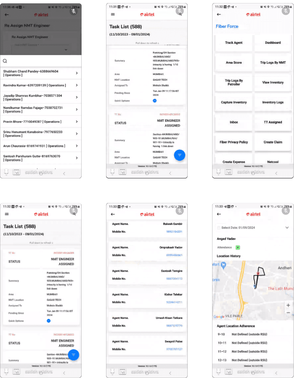
COMPETITOR ANALYSIS
Let’s dive in and explore how our competitors are addressing similar problems. We'll analyze their app structure and key design considerations. Airtel, being one of the competitors, is included in this analysis. Below are a few screenshots of their app for reference.
INFORMATION ARCHITECTURE
One FO is a bundled app serving a diverse range of users across four different verticals. Now, let's move on to designing the app's information architecture.

DESIGNS
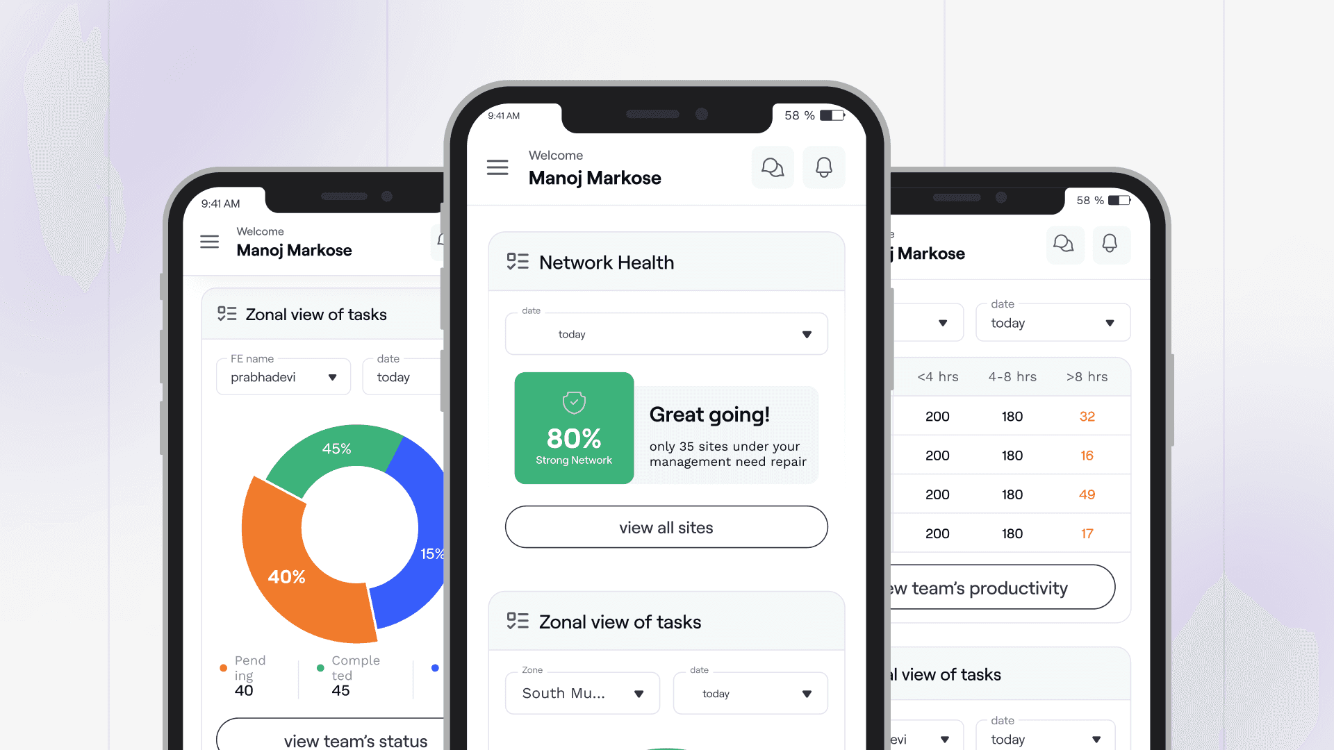
Home screen of One Force app
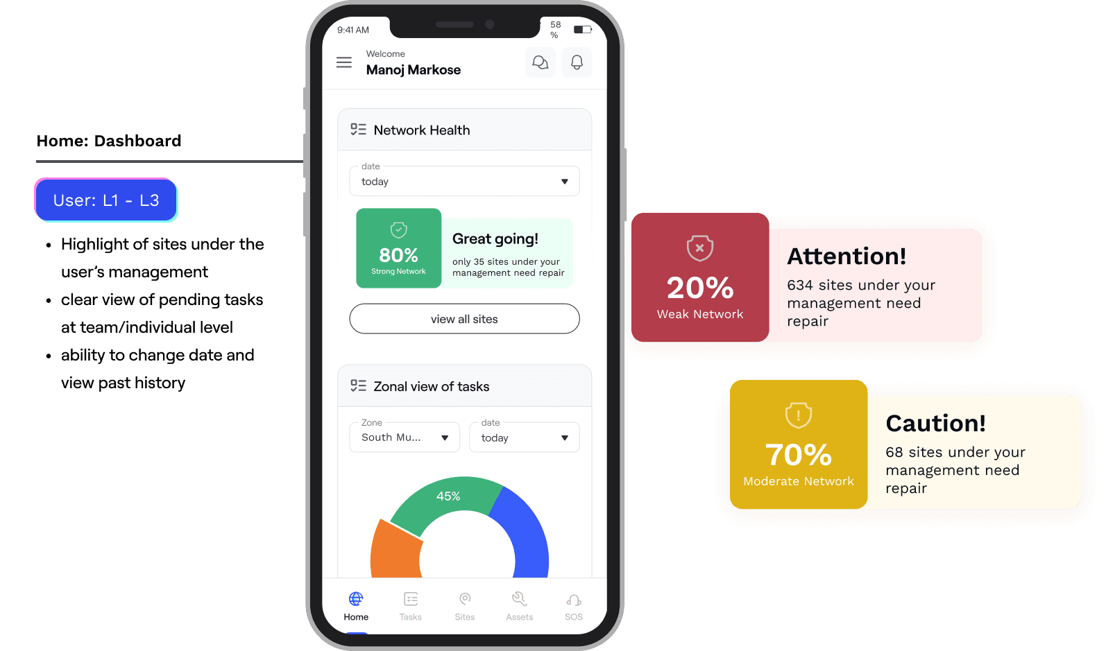

Task page

Bottom navigation
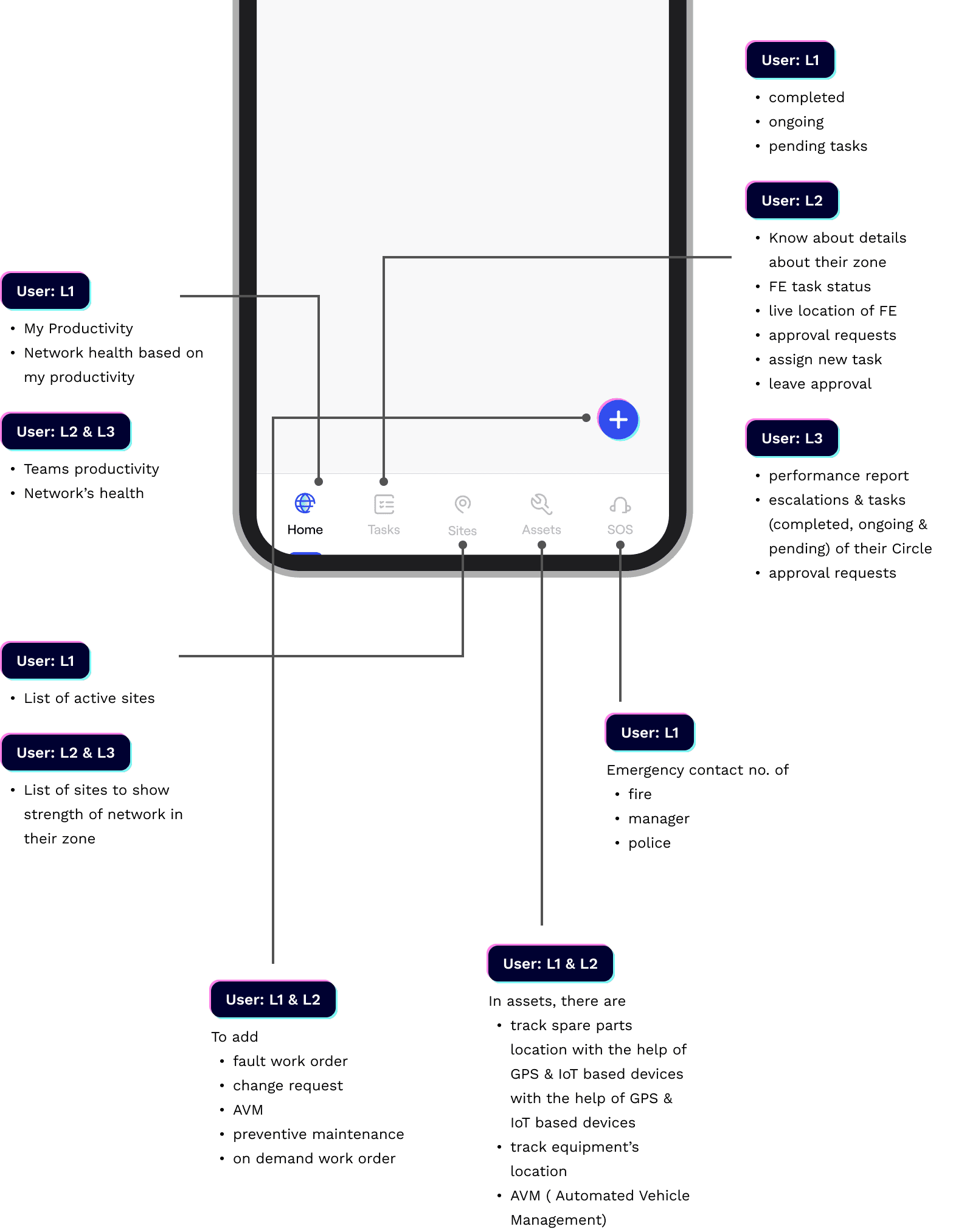
Top navigation

IMPACT
During the internal meeting with the IT Infrastructure team: they
appreciated the presentation.
They appreciated the presentation. I noticed a sense of relief when they saw the image of a Field Engineer on the tower, as it reassured them that our team is capable of successfully executing the redesign.
THAT'S A WRAP
Given that this is a bundled app with numerous screens, the above are
just initial drafts of the design team's work. These screens will be
deployed in phases.